Fédération Française de Handball

the project
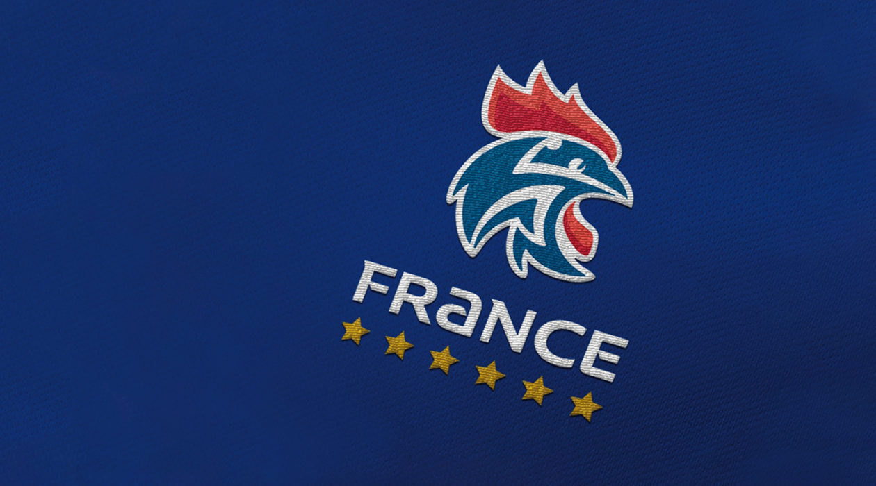
We designed strong, powerful and impactful symbolism based on the French national team’s image so every player can identify with its exceptional achievements embodied by strong values: pride, performance, and conquest.
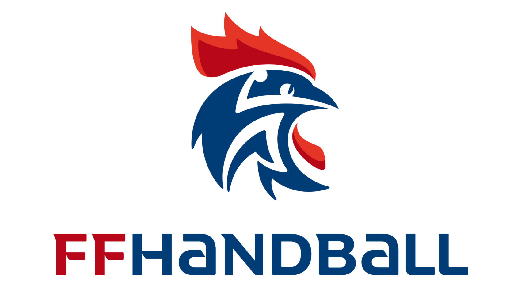
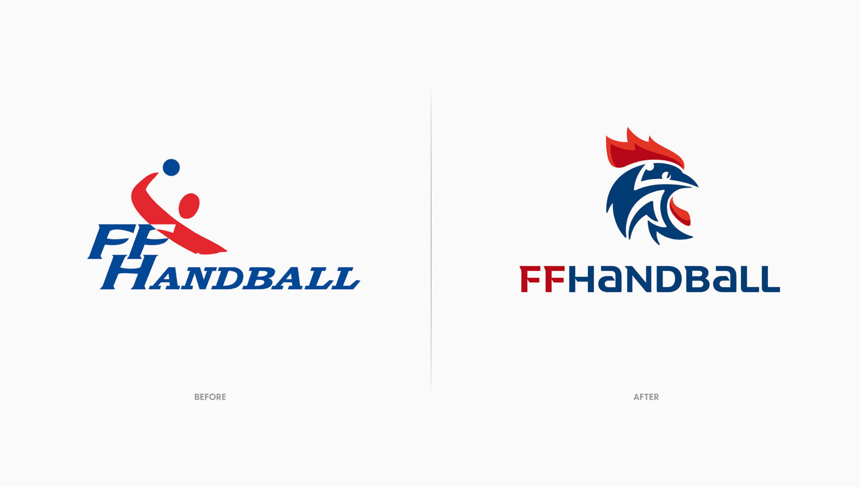
The agency’s proposal concentrated on three combined symbols: the rooster, the handballer, and the colors red, white and blue. A dynamic silhouette of a handballer taking a shot appears in the rooster’s head. This dual imagery gives it a unique identity given the numerous other French federations using the rooster as their emblem.
Thanks to its inspired use of comic strip-inspired features, the rooster is intended to attract a young, passionate and enthusiastic clientele. The capital letters used for the typography convey an institutional, federal dimension.
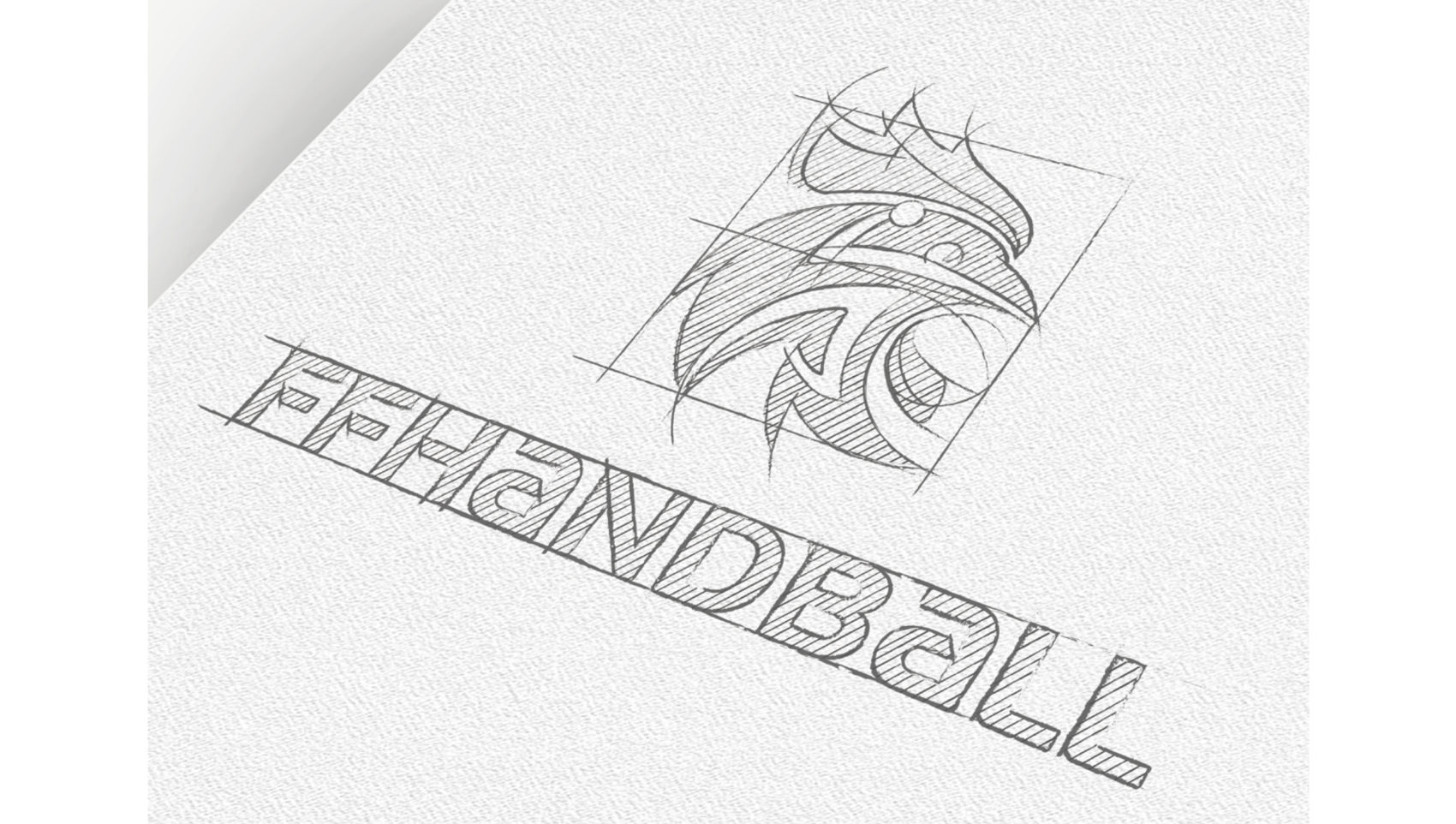
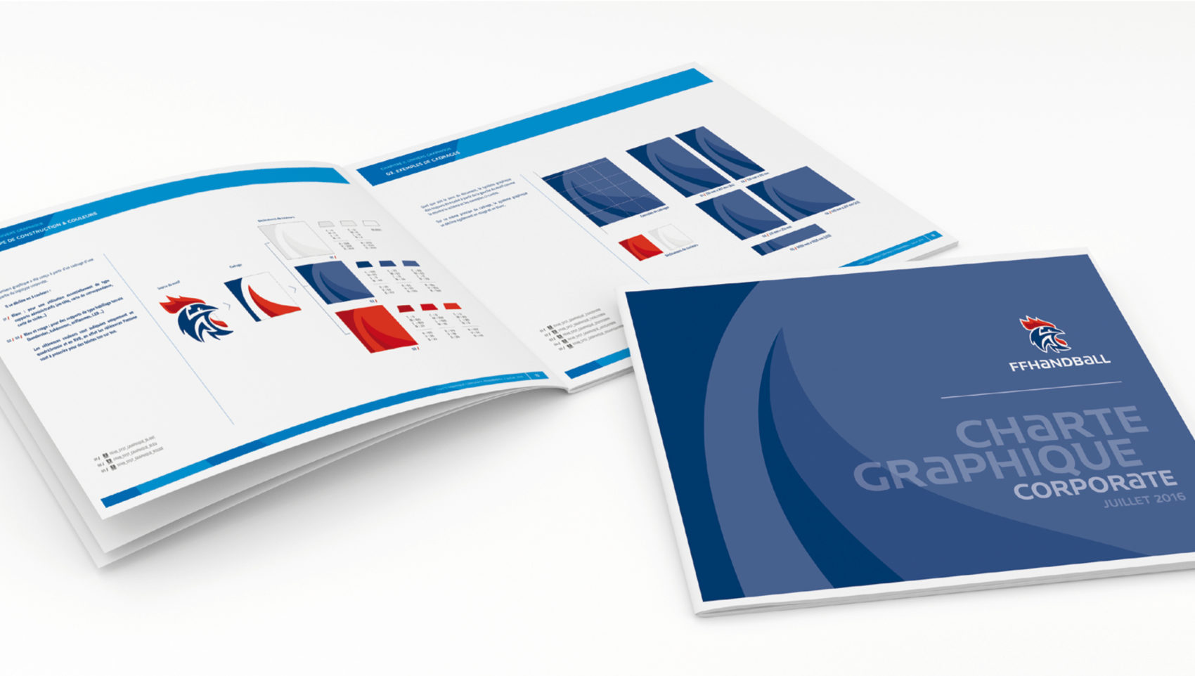
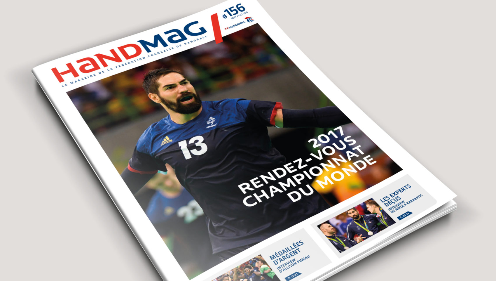
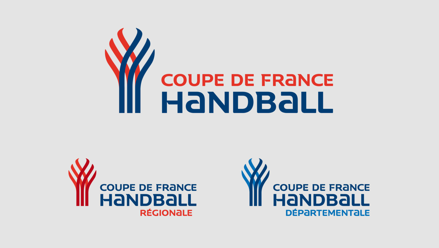
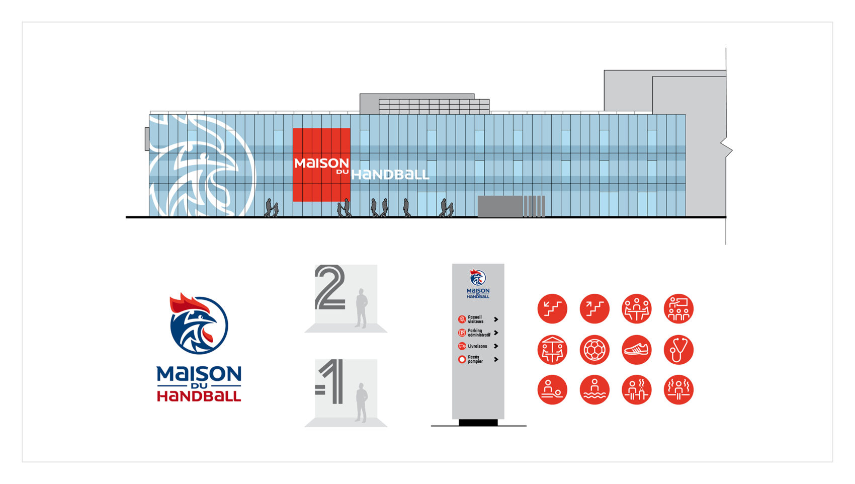
An entire alphabet was also designed to reinforce the Federation’s identity. This makes it possible to standardize all the adaptations of this identity for the new platform, from the competitions organized by the Federation to the marketing tools, as well as the more specific identity for the Maison du Handball, the Federation’s new headquarters.
Client
Fédération Française de Handball
Years
2015/2018
Tasks
Brand architecture
Visual identity
Graphic environment
Publishing
Standardization
Signage
Award
Grand Prix Stratégies du Sport 2017 : Silver Prize, design category
