FRENCH WRESTLING VISUAL IDENTITY

the project
Less than 3 years before the upcoming Paris 2024 Olympics, the French Wrestling Federation is anticipating the exposure that this event will bring and is evolving the image and perception of the sport to engage a broader audience and attract younger generations.
Therefore, the federation has called upon us to thoroughly review its brand strategy and visual identity.
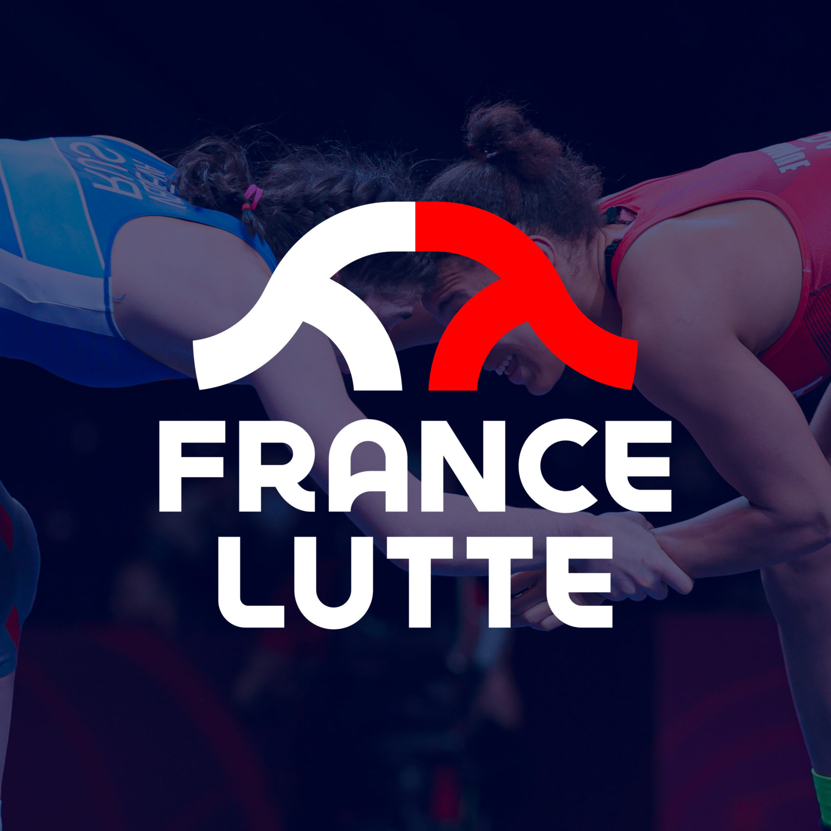
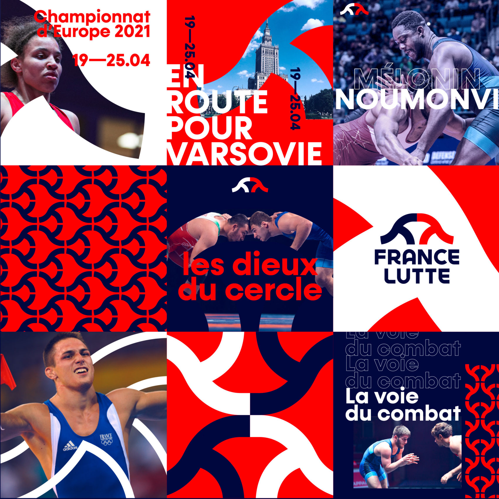
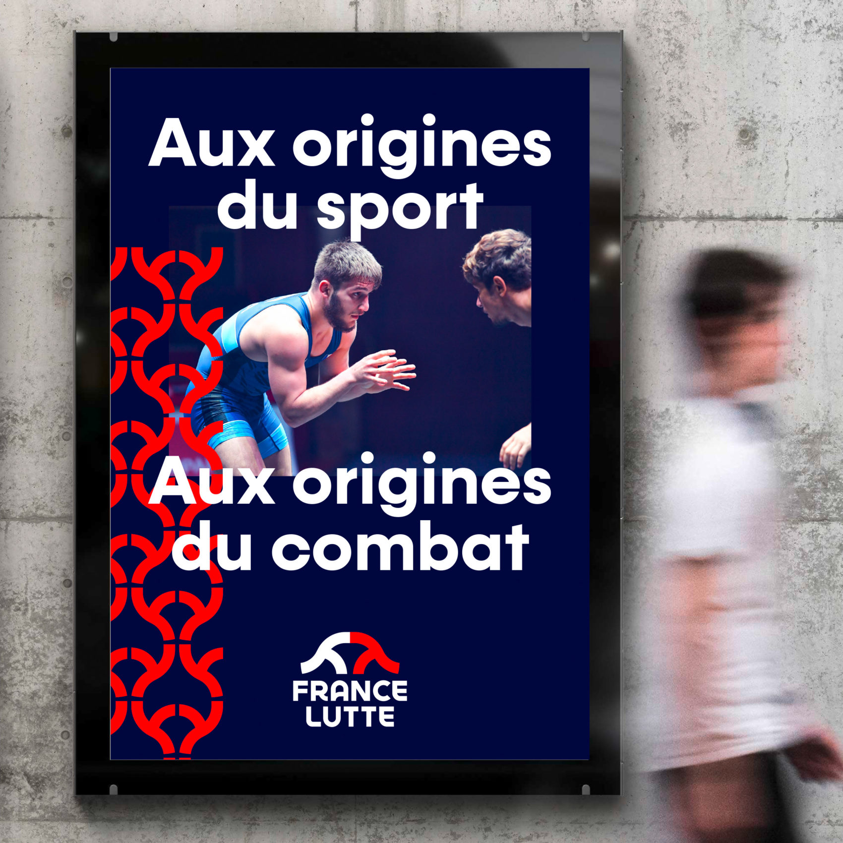
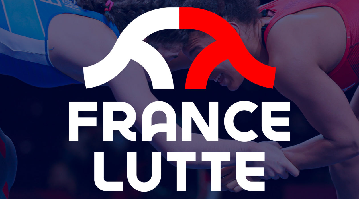
Our teams began this process by creating a new tagline: ‘France Lutte.’ This new name immediately promotes the sport by reaching out to non-initiated individuals. To carry this new tagline and stand out from other federations that overuse illustrative depictions of fighters, the federation opted for a more conceptual approach, balancing evocation and figurative representation.
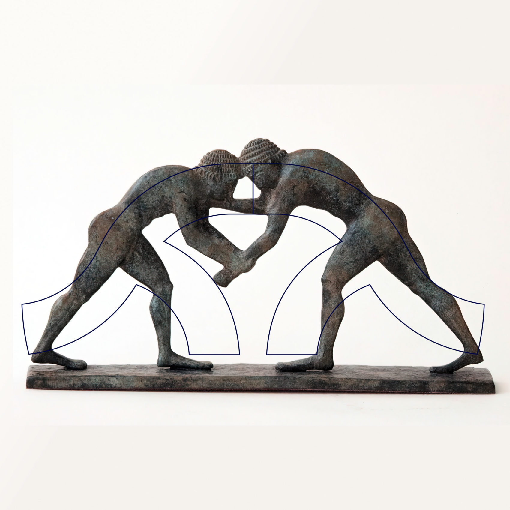
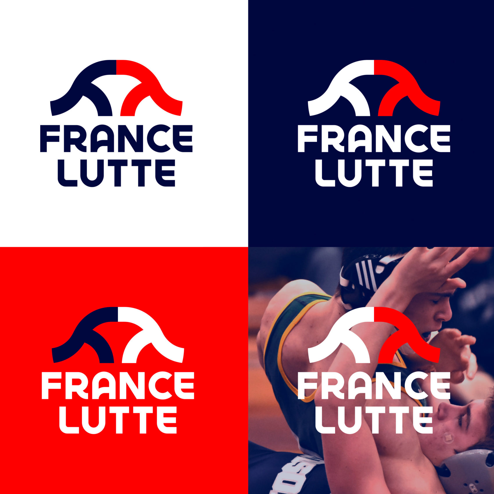
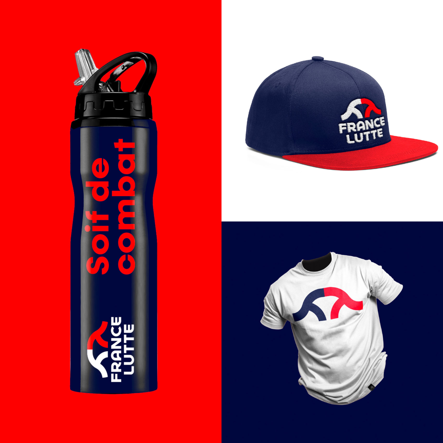
Leroy Tremblot’s creative teams also designed a new symbol. Inspired by the portrayal of fighters in ancient Greek sculptures and bas-reliefs, this new symbol depicts the defensive stance of two wrestlers facing each other with a simple and modern form. This symbol embodies the values of Wrestling: commitment, energy, determination, and evolution. The blue and red palette emphasizes the notion of confrontation while elevating the colors of France.
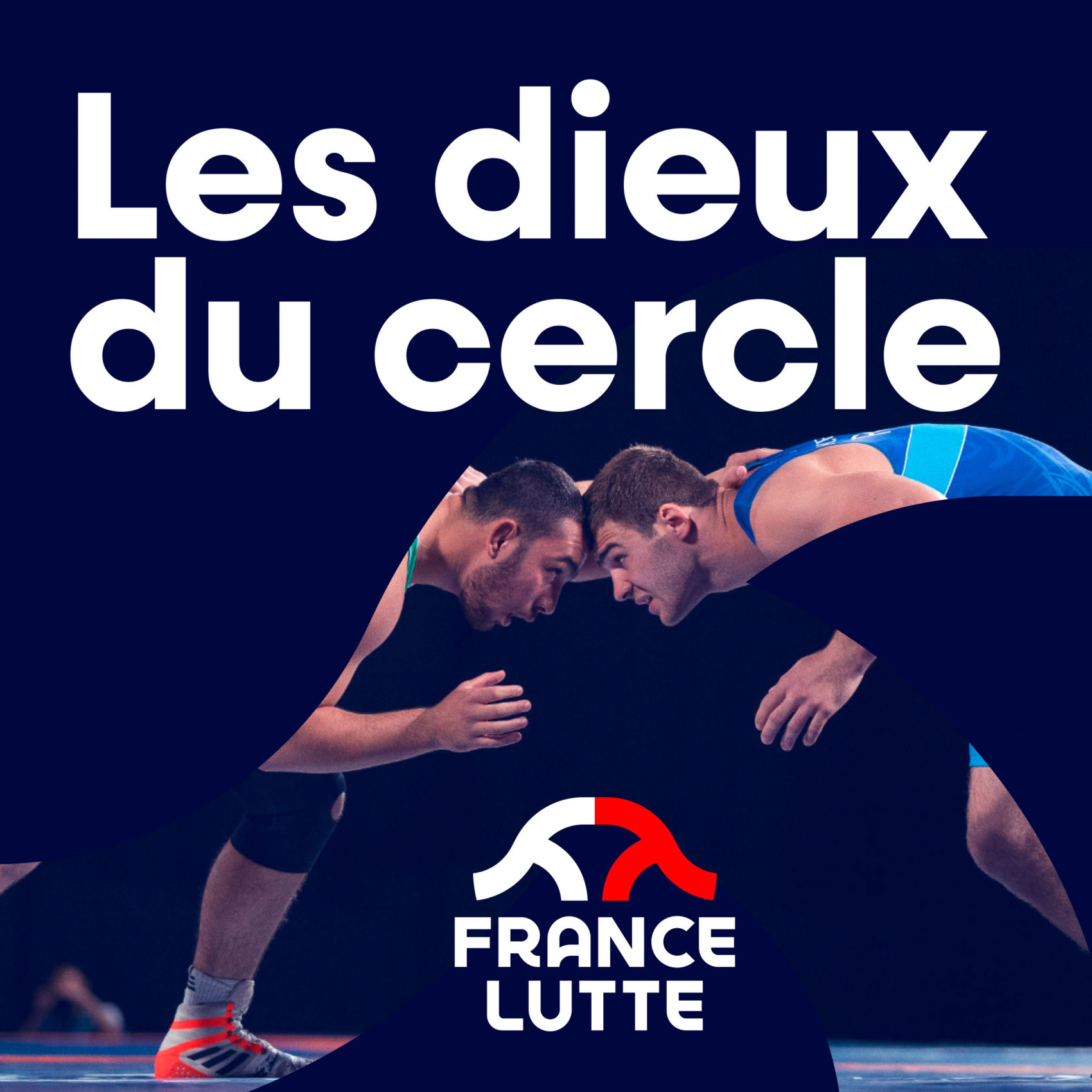
A new typeface complements this rebranding effort, designed to harmonize with the shape of the symbol. It allows for easy application across the entire brand architecture, including other associated disciplines (sambo, grappling, gouren, and Beach-Wrestling), the federation network, the French teams, and amateur competitions.”
CLIENT
FRENCH WRESTLING
YEAR
2021
TASKS
Brand strategy
Identity design
