FC Nantes asked Leroy Tremblot to create its new visual identity
Drawing inspiration from the past to create a new future
Following a call for tenders, FC Nantes asked Leroy Tremblot to redesign its visual identity and support its brand strategy. This change meets the Club’s need to develop its influence and presence.
The decision was made to create a brand identity that is both innovative and respectful of FC Nantes’s heritage:
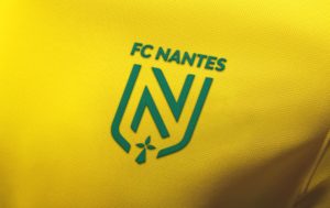
To promote harmony and modernity, the new logo is now based on the letter “N,” in a dynamic and sport-inspired style, to highlight the club’s regional roots and its association with Nantes. This elegant typographic design fits in perfectly with a sleek and open shape inspired by the city’s coat of arms.
The overall design is now simpler and more up to date, using sleek lines and inspired by the vertical green and yellow stripes of the shirt, to which Nantes supporters are so attached. The ermine, symbol the city’s past connection with the duchy of Brittany, is centered at the bottom of the coat of arms, like a signature.
“FC Nantes,” the club’s historical name, stays in capital letters, crowning the new visual of the club.
Sleeker, more elegant and simpler, it aims at a young and enthusiastic audience and should help attract new partners and contribute to the build the club’s reputation. It has all the qualities of the brand concepts of major sporting clubs, with far reaching potential for development in terms of marketing and merchandising.
Unveiled on Wednesday by the club, it will be worn by the players on the new shirt in the final game of the season against RC Strasbourg this Friday at the Stade de la Beaujoire.


