New Identity of League 1 – A Modular & Iconic Mark
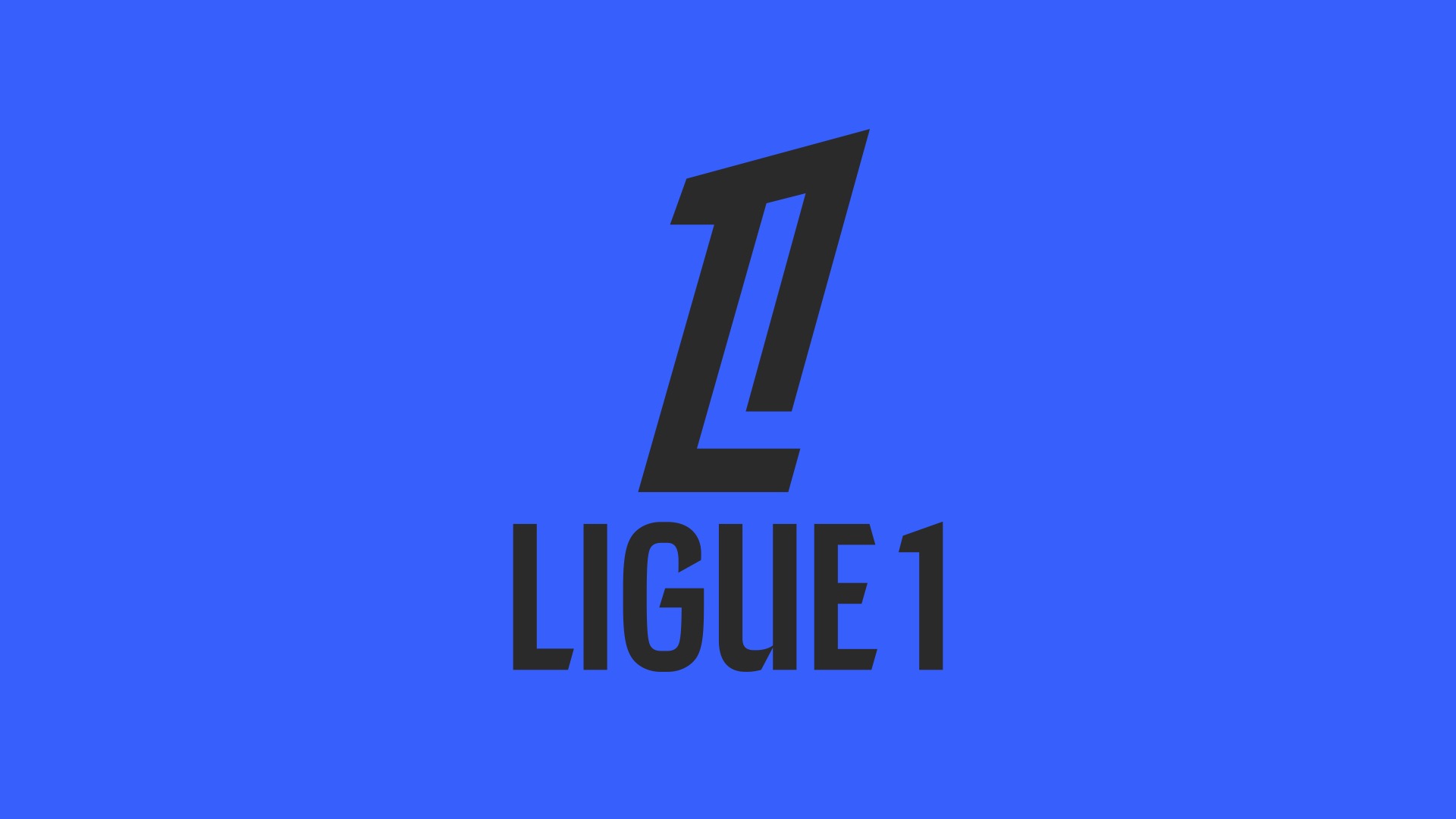
A new logo for the French football championship : iconic and modular
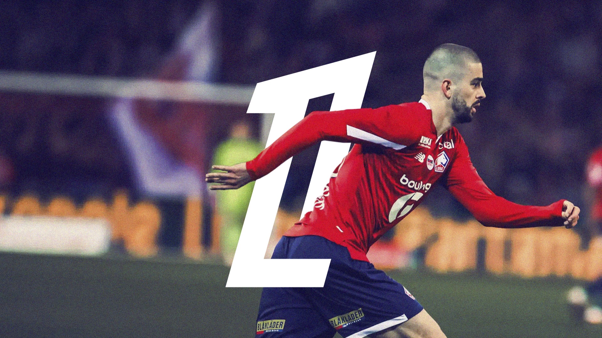
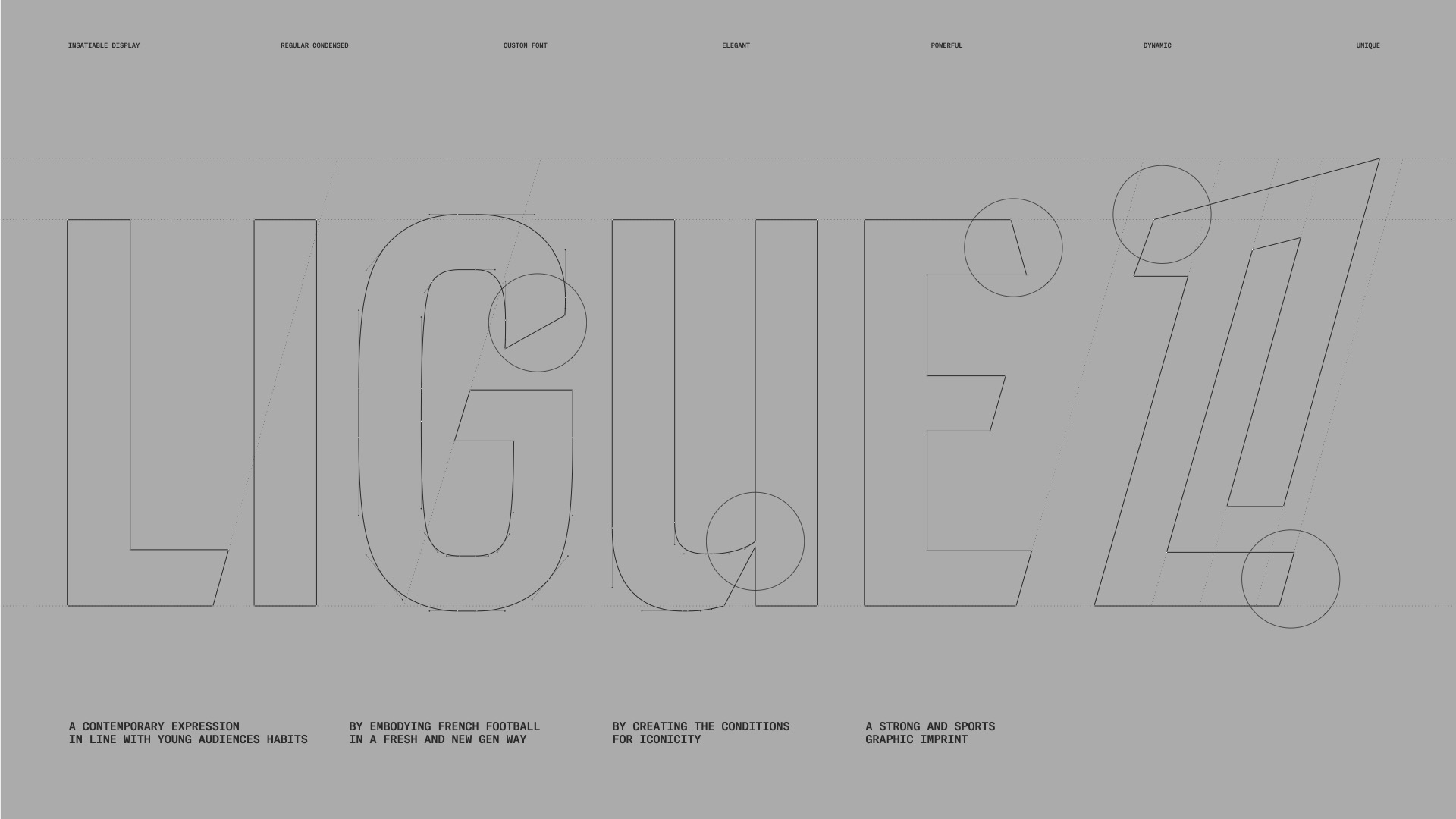
In preparation of the upcoming season 2024/2025 and as part of a new marketing strategy, LFP Media completely reimagines the visual identity of the French Ligue 1 championship. We are proud to present this new symbol that embodies the brand’s ambitions of elevating and iconicizing the championship. The new mark stands out by highlighting the ‘1’ associated with the ‘L’ through a subtle interplay of form and counter form. It thus adopts the common abbreviation of fans, the ‘L1’.
A modular identity
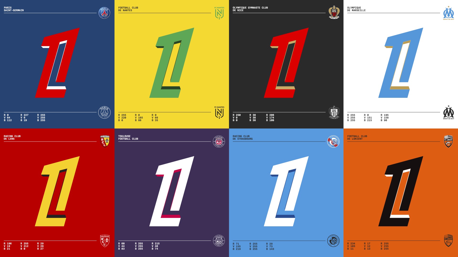
The new Ligue 1 logo not only stands for the French championship, its competing teams, but above all the diversity that it characterizes, in terms of game, style, atmosphere, and traditions. Through its simplicity and distinct modularity, it naturally adapts to each club and becomes a unifying mark with a nod to codes found in gaming and digital eco-systems. This logo, is accompanied by a custom typography, a vibrant color palette, and a flexible graphic system and aims to boost pertinence of Ligue 1, both in France and internationally. Its bold and contemporary design breaks traditional codes to assert the uniqueness and prestige of the championship.
Official Launch
The new symbol of Ligue 1, unveiled by LFP Media on March 27th, will be deployed on all fields and screens starting from mid-August.”
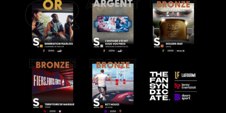
The Fan Syndicate group wins 5 awards at the 2023 Sports GP Strategies!
Leroy Tremblot wins Bronze at the Grand Prix Stratégies for Sports & Esports 2023!

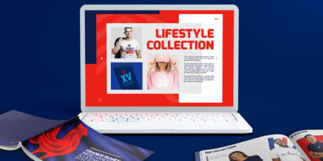
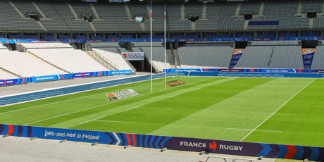
The French Rugby Federation selected the branding agency Leroy Tremblot for its “France Rugby” style charter

The CDES reveals its new identity this autumn
A signature Leroy Tremblot brand strategy and graphic environment
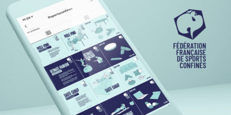
LaFourmi and Leroy Tremblot have created the “Fédération Française des Sports Confinés”
Leroy Tremblot win Gold at Grand Prix Stratégies du Sport 2019 awards
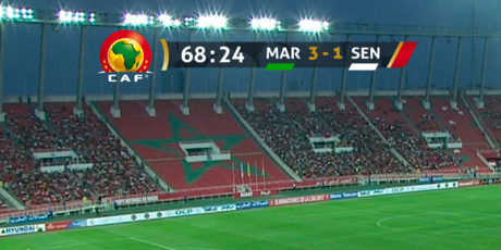
Leroy Tremblot creates the TV graphic branding for the 2019 Africa Cup of Nations
FC Nantes asked Leroy Tremblot to create its new visual identity
Drawing inspiration from the past to create a new future
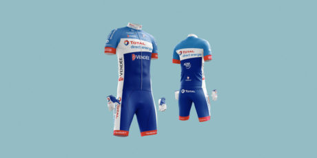
Leroy Tremblot brands the Total Direct Energie cycling team for the next Tour de France
