Leroy Tremblot designs the French Rugby Federation’s new identity
After consultation, the French Rugby Federation selected the branding and design Leroy Tremblot agency to manage the overhaul of its visual identity.
Inspired by the original cockerel that players wore on their left breast for the first match in the history of French rugby in 1905, the agency worked on making its form, design, colour and texture feel more modern and forward-looking. Removed from its original context, the cockerel has been endowed with all the necessary qualities to allow it to function effectively across all communications by the Federation.
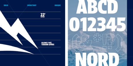
Over and above the lengthy sourcing work involved, the agency also worked on the identity conveyed by all the logos (network, advanced level, practices, training, and commissions). In this way, all the derived identities organised through a new brand architecture expressed by means of an exclusive typeface specially created for the occasion.
Noble and powerful, robust and elegant, the typeface lends coherence to the new federal emblem and captures the spirit of dynamism and modernity. The result is a resolutely modern composition that embraces the values of a traditional yet forward-looking sport. This symbol promises to revive the history and legend of French rugby while supporting the discipline and providing its fans with an expanded offering of practices.



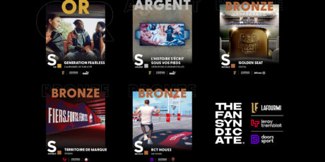
The Fan Syndicate group wins 5 awards at the 2023 Sports GP Strategies!
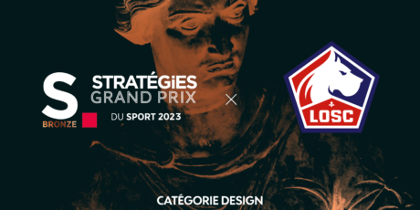
Leroy Tremblot wins Bronze at the Grand Prix Stratégies for Sports & Esports 2023!



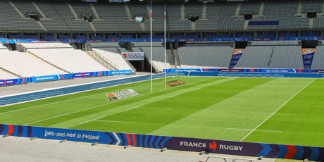
The French Rugby Federation selected the branding agency Leroy Tremblot for its “France Rugby” style charter

The CDES reveals its new identity this autumn
A signature Leroy Tremblot brand strategy and graphic environment
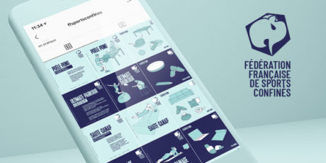
LaFourmi and Leroy Tremblot have created the “Fédération Française des Sports Confinés”
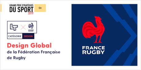
Leroy Tremblot win Gold at Grand Prix Stratégies du Sport 2019 awards

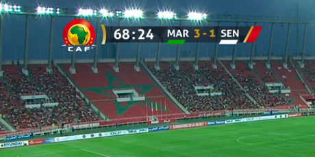
Leroy Tremblot creates the TV graphic branding for the 2019 Africa Cup of Nations
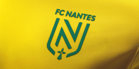
FC Nantes asked Leroy Tremblot to create its new visual identity
Drawing inspiration from the past to create a new future
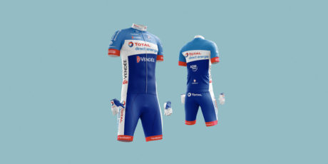
Leroy Tremblot brands the Total Direct Energie cycling team for the next Tour de France
